
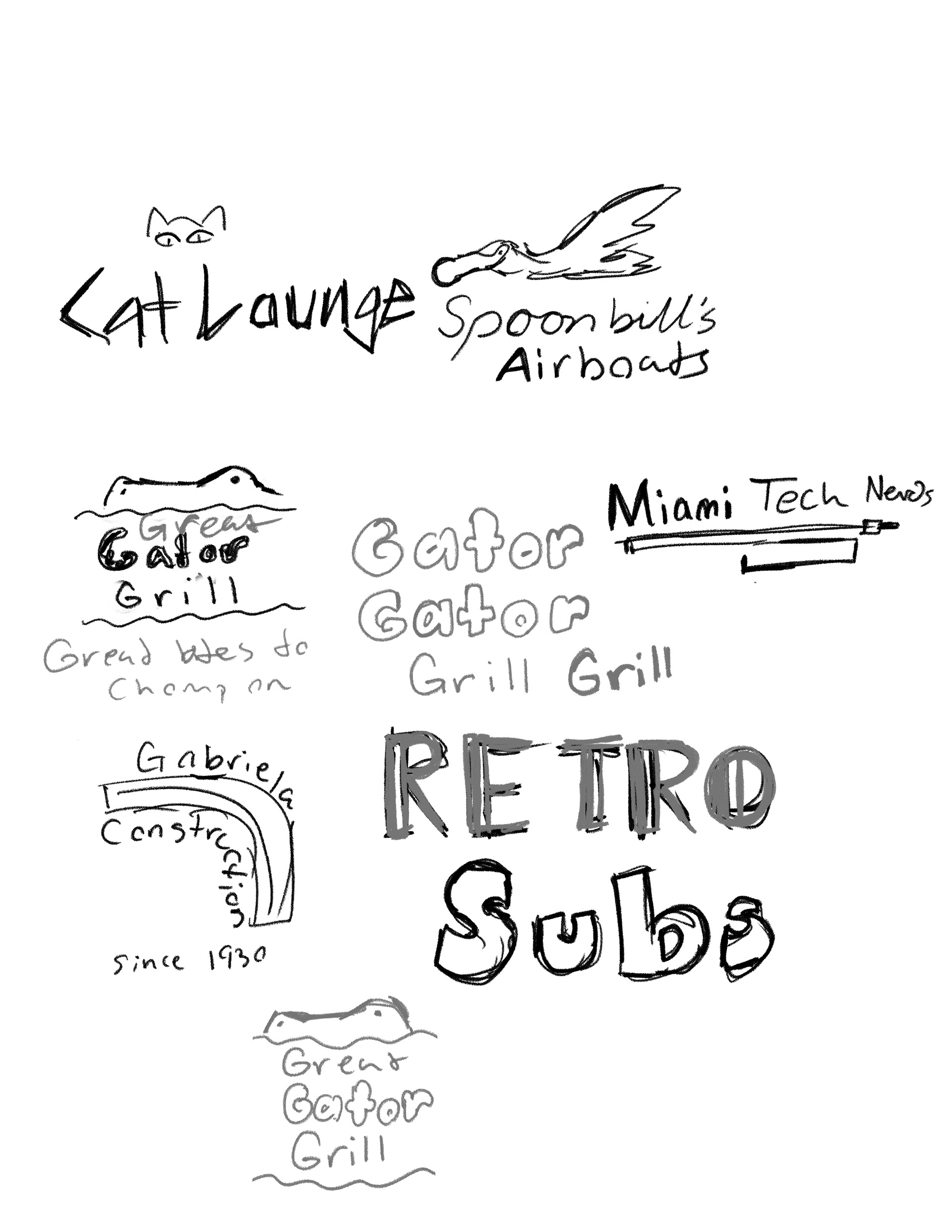
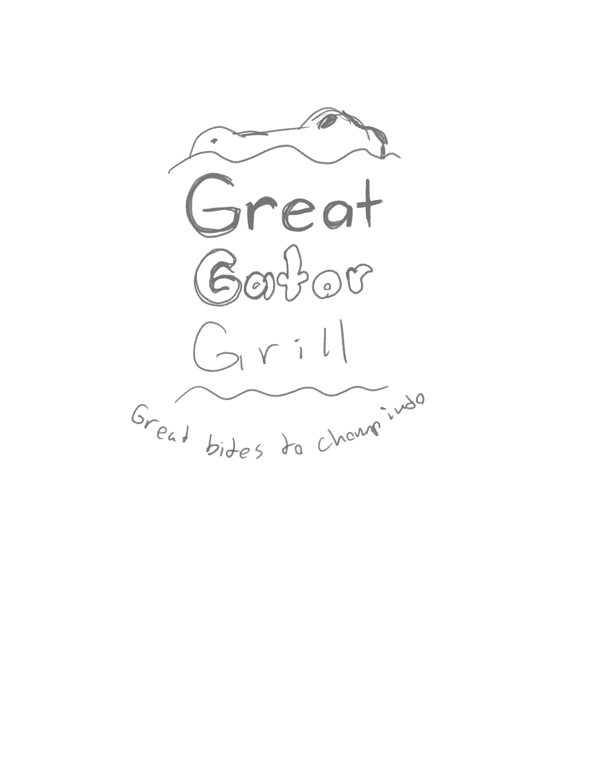
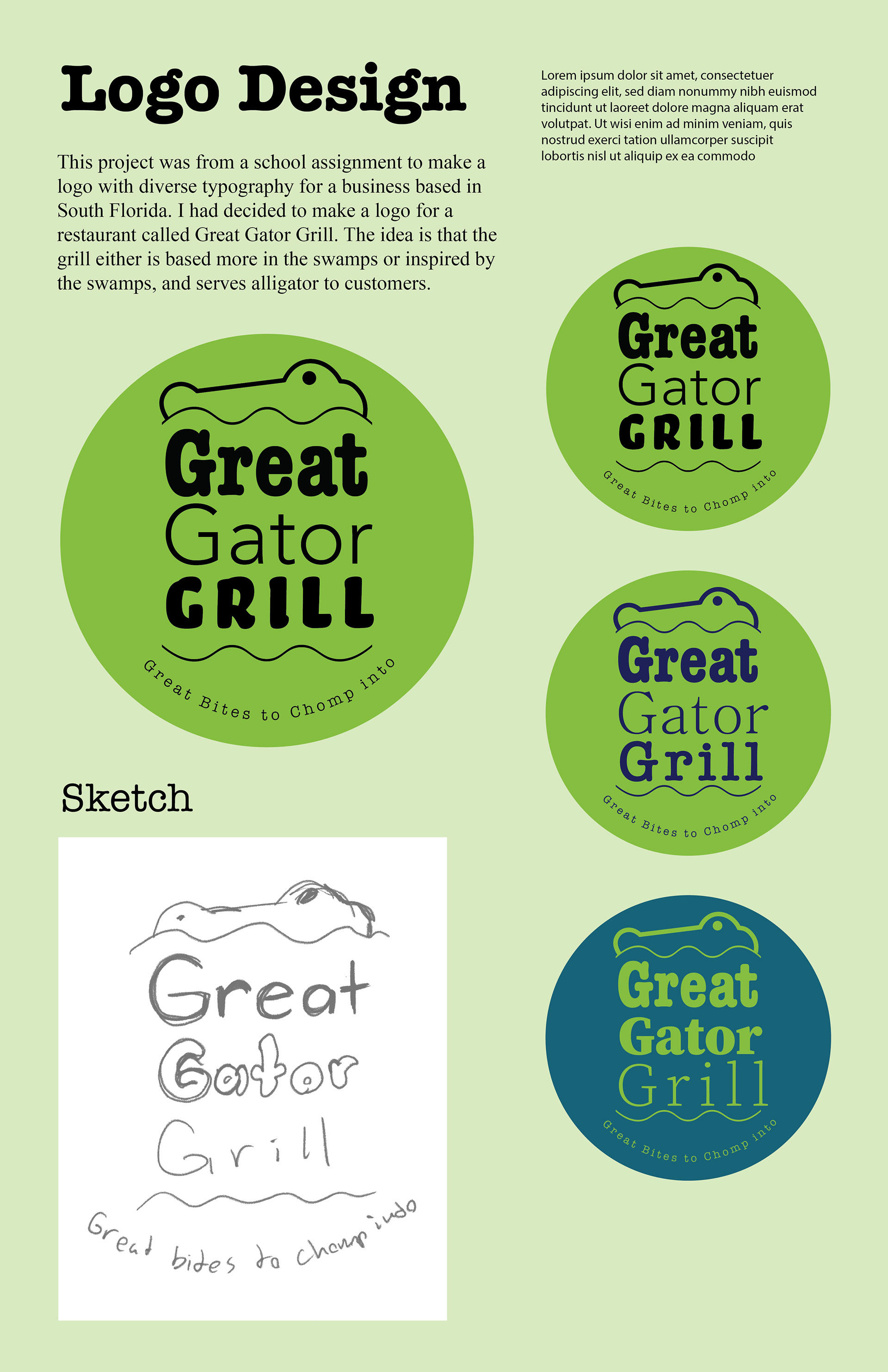
Great Gator Grill is a brand for a restaurant that would be located in South Florida, for an assignment where a brand logo had to be made with multiple types of fonts which would be for a Florida based business. There also had to be multiple versions of the logo, for all of them I kept the color green since it is the color that is associate with alligators.
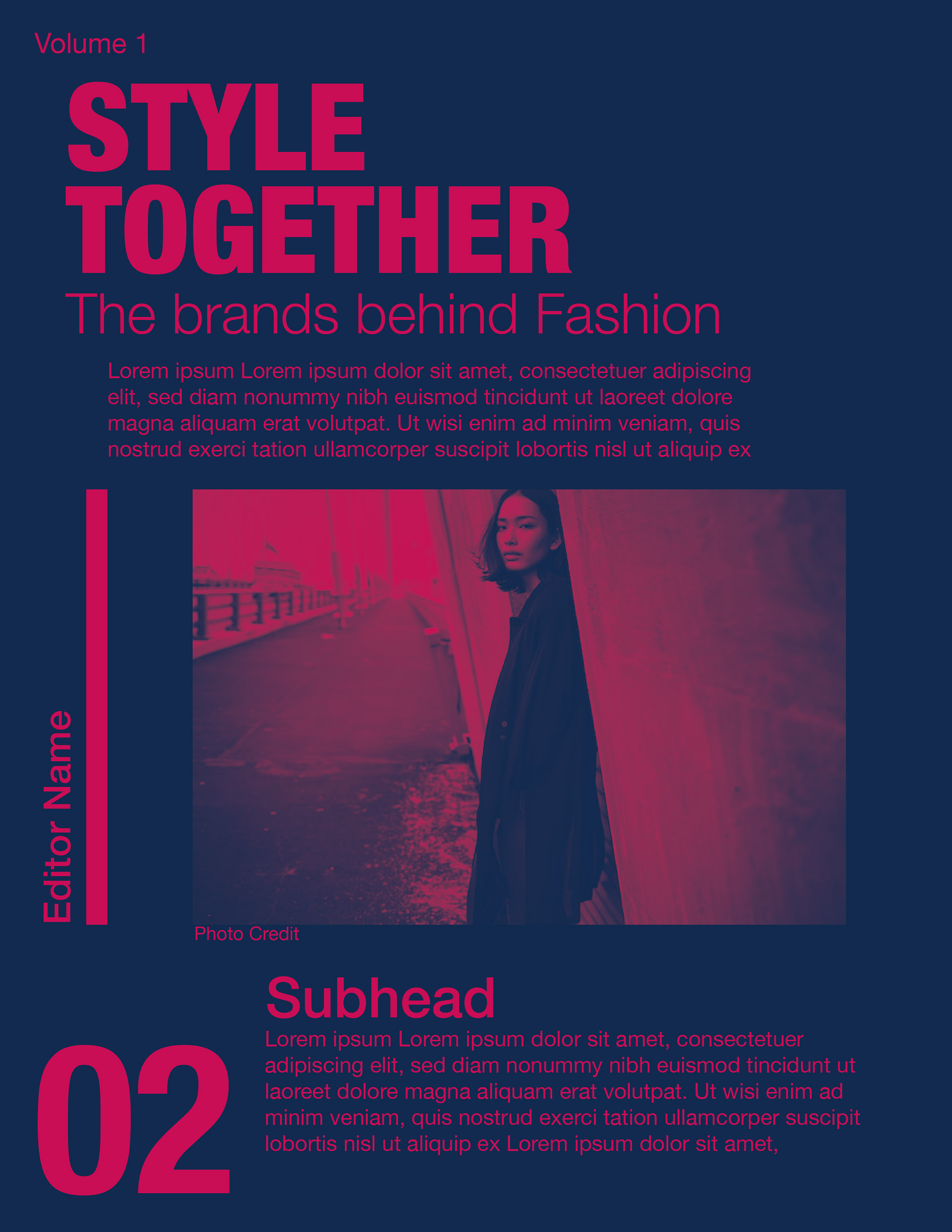
Created in Illustrator, these two pages were from a modern editorial page design assignment. Meant to practice creating page designs that weren't like the conservative ones that are usually seen in news or magazines.
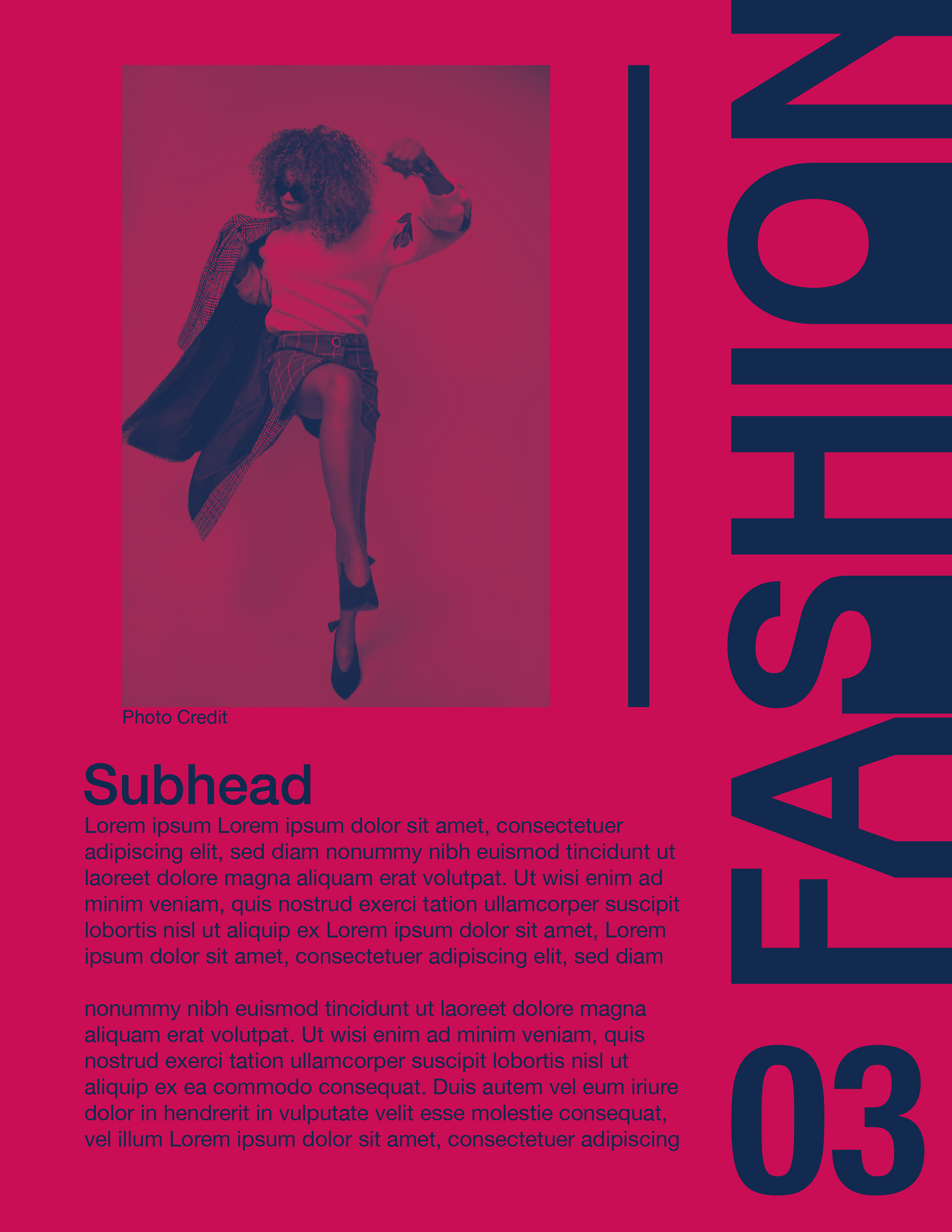
For my page designs, I wanted to go with something more simple yet bold, hence the choice of only having two colors and large text on the sides of the pages. Of course the heading would be in big text but I also made the page numbers larger. I chose a sort of hot pink and a dark blue to contrast from each other, and these types of colors are my favorite to put together in my designs.
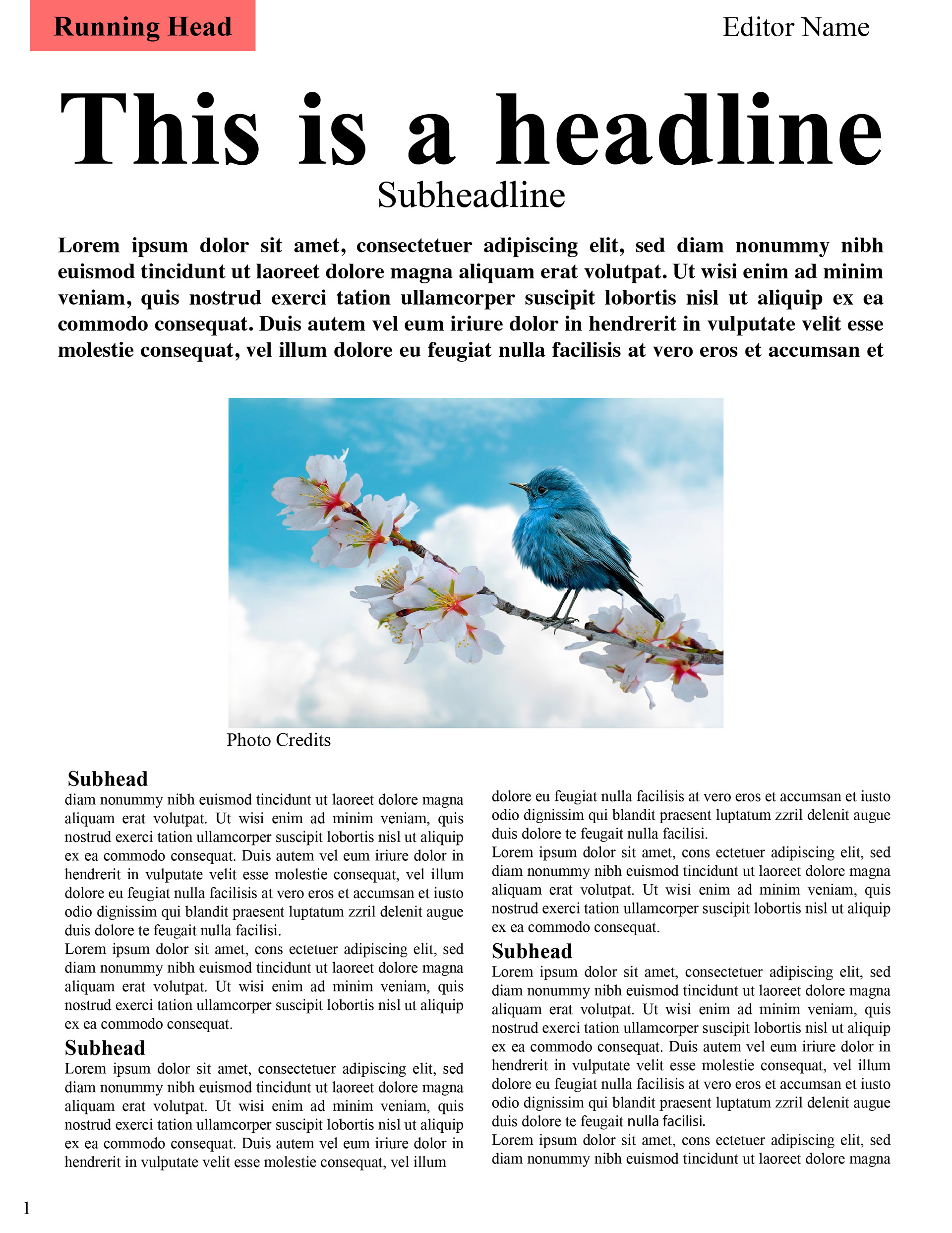
This a conservative editorial page design made for an assignment. I made sure to keep the design organized with a heading, subheadings, and the body texts. Very few colors, which are only on the running head and photos. The body texts are separated in sections with subheadings at the start, for when new paragraphs or content comes up.
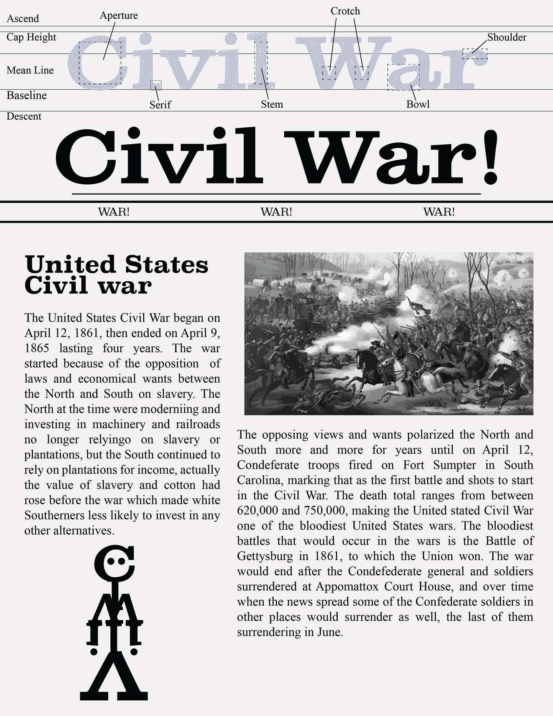
This was one of the many assignments that had us creating page designs with the focus on a subject we had to pick and a font to use, and I chose the American Civil War. I took inspiration from the old newspapers that was made during the civil war for my page design, keeping with the black and white, and using the Clarendon Wide Medium font. The illustration on the left bottom corner is supposed to look like a person, made from the letters of the page title.
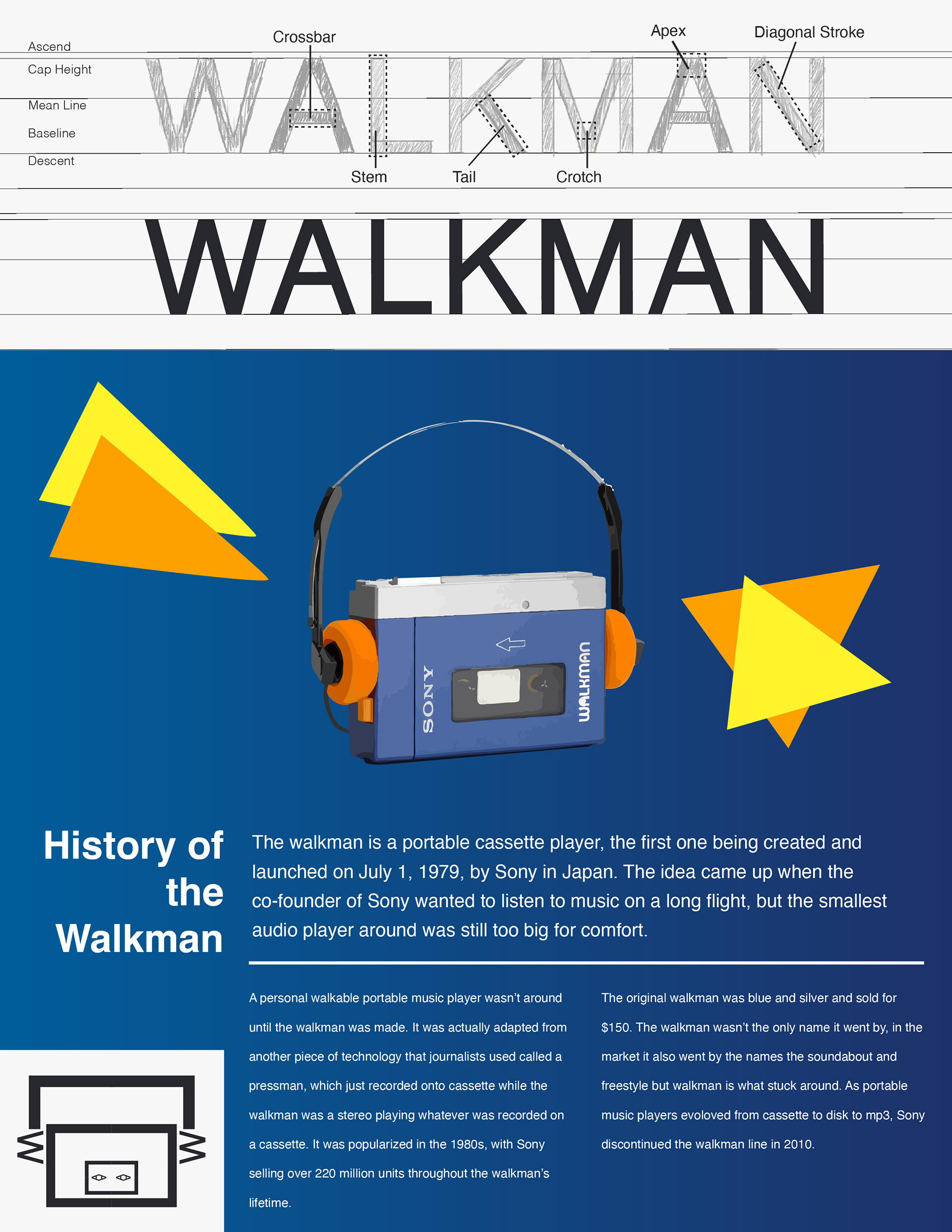
From another page design assignment, I picked the walkman as a topic to write about. Taking inspiration from the packaging some walkman were in, I added some gradience and bright colors. The word are sectioned and laid out similarly to what I saw on the packaging, changing the sizes and weight of different sections to show what information is more crucial, like the headline being the biggest type. On the bottom left corner is an illustration of a walkman which is made from the letters of the title.
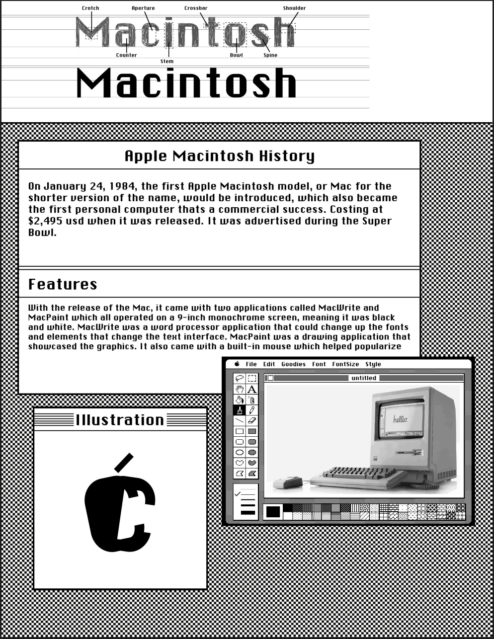
This page design is supposed to look like the screen of the first macintosh computer from Apple, since the topic is about that product. I also used the Chicago font which was used for the computer. The information placed in boxes like the applications to fit in with the screen look. The illustration is supposed to mimic the Apple logo, made up of the letters from the subject title. The image that was used is of the first Macintosh which was image traced before I placed it in a window that is supposed to be the MacPaint, supposed to look as if the image was made in MacPaint.
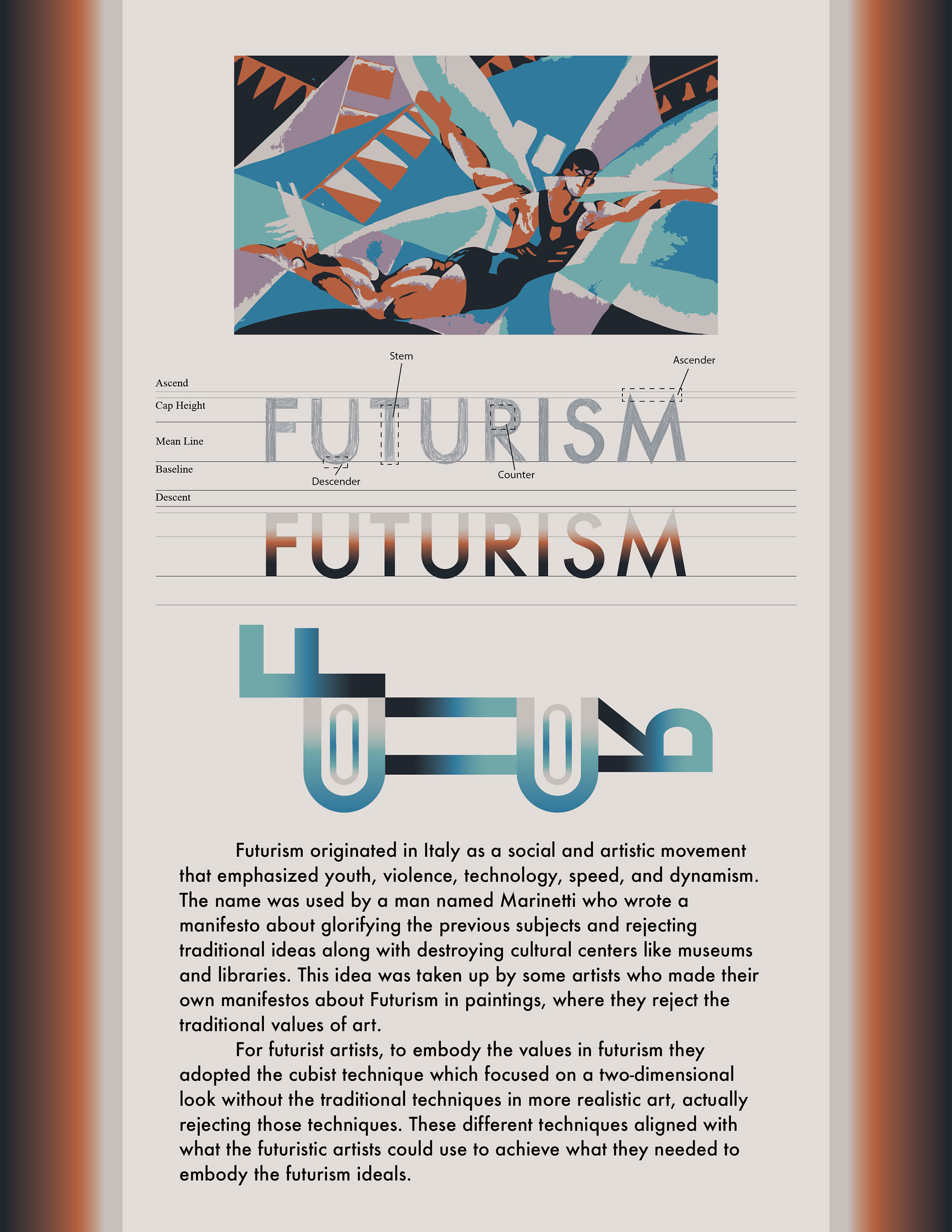
For the topic of Futurism, I took inspiration from the gradience in the art from that period. Since there was an emphasis on technology I made the shape of a car with the letters from the title. For the hierarchy of the page layout, I put an emphasis on the futurism design with the image being on top, the title right under that, the illustration in the middle as the subject of importance, and then the text being at the bottom with the information but also being the subject to take up most of the space.